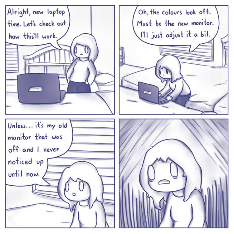
So I’ve been having a busy week, and I have other things planned that I’ll hopefully get to go into detail soon enough, but for now, I got a new laptop, and as you can see, I’ve run into a bit of an issue. I’m secretly hoping I just need to adjust the screen to fix it, but evidence is making me think my old monitor was a bit off-colour and I’ve been using the wrong colours this whole time without realizing it. I tried my best to replicate it on this monitor, but it still seems a bit off from what I initially intended, but this page still looks closer to what I thought I was churning out compared to other comics.
So I would really appreciate some feedback on how this page and the next few compare to previous comics. Are they better? Worse? Too much blue? Too much grey? I never looked into this before, so I’d like some specifics from whoever I can get it from. I’ll be fiddling around, possibly taking this opportunity to simply try new things anyway, but for now I’d like to apologize if any issues with quality have been eluding my attention up until now and I’ll keep y’all updated.
Also, yes, my magnificent artist’s studio is just two beds next to each other and a dinky laptop. With professionalism such as this, it’s a wonder I ever encountered problems in the first place. The kind that almost always have a name.

All comics before this one look dark gray to me, this one is lavender.
I would say the comics used to be a purplish-bluish-grey, while this one more purplish-bluish and less grey.
I actually did a bit of analysis on the comic images, but upon further consideration I realized that you probably already know everything I could say from that, so I’ll omit it. As for the feedback you actually want: I don’t think the difference is as noticeable as a reader as you may fear, especially since it follows a color-light comic. Personally, I think I like the old color more, though that may just be because I’m used to it.
Like I said, however, the difference is not major to me. If you’re taking suggestions, though, I’d reduce the saturation somewhat. Not necessarily all the way back to the old level, but I do prefer the bluish-grey to the greyish-blue.
Yeah, this page came out much blue-er and kinda darker than before. Not that I’m complaining, as I feel it’s easier on my eyes.
I see it the same way scared does — this one is visibly purple, as opposed to a cool gray. The shading is also darker, comparing panel 2 to a similar panel 2 in 717. I prefer the older shading (except in panel 4), but the color difference isn’t better or worse to me, just different.
Thanks everyone. It looks like most if you are seeing the same faded grey to purplish blue transition, which raises concerns since neither are colours I intended, but we can blame my poor monitor and eyesight on that.
I intended to use a more bluish grey than how the old comics came out, especially since the shading on older comics seems more faint and hard to see than it did to me while drawing it. I have a clear idea what everyone’s seeing on their end , so now I guess it’s only a matter of me fiddling with the colours to try and get the one I want for once. Thanks for the feedback everybody.