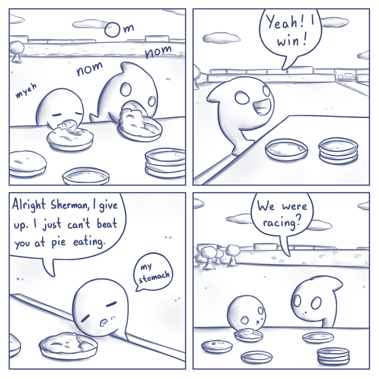
Of the colours I’ve tried so far this one probably came out closest to the old colour I’m trying to replace, which is unfortunate. I’m still kicking myself for going years without noticing, but that mystery shade of bluish-grey is out there somewhere. I’ll find it eventually!
Which do y’all prefer so far, if I may ask?

I like this one the best of the new bunch so far. I don’t notice much difference in color between this and 738, but the shading is gorgeous here. I don’t know if that was due to a process change, or just the subject matter.
The lighter, older comics feel like pencil, where the new ones feel like pen and ink. Both work well with your art style, and I’m pretty sure I’d prefer whichever one I was used to. Really, I prefer whatever style you have the most fun using, because comics are nearly always better when the creator is having a good time!
The process is always the same, I just need a good shade that works best with the lineart, shading, and background layers. For this colour the latter two come out more grey than I expected from the lineart, but the feedback sure helps.
I have to agree, this is so far the best of the new ones. I feel like the previous attempts make the lines a bit too “heavy” or “bold” or somesuch. I like the “softness” of this one (sorry for the vagueness, art critique is not my forte).
Whatever you settle on will be fine, of course, and won’t stop me from reading. Unless you suddenly start doing the comics in magenta; do that, and I walk. (Not really.)
I don’t really understand art things, but pie, now there’s a subject matter I can sink my teeth into. The darker colors do seems to show up better in shading tho.